Help:Table
| Wiki markup |
|---|
A table is an arrangement of columns and rows used to organize and position data. Tables can be created on Wikipedia pages using special wikitext syntax, and there are many different styles and tricks that can be used to customise them.
Using the toolbar
To automatically insert a table, click ![]() or
or ![]() (Insert a table) on the edit toolbar. If "Insert a table" is not on the toolbar follow these directions to add it.
(Insert a table) on the edit toolbar. If "Insert a table" is not on the toolbar follow these directions to add it.
The following text is inserted when Insert a table is clicked:
{| class="wikitable"
|-
! Header text !! Header text !! Header text
|-
| Example || Example || Example
|-
| Example || Example || Example
|-
| Example || Example || Example
|}
This code will produce the following table:
| Header text | Header text | Header text |
|---|---|---|
| Example | Example | Example |
| Example | Example | Example |
| Example | Example | Example |
The sample text ("Header text" or "Example") is intended to be replaced with actual data.
Pipe syntax tutorial
Although HTML table syntax also works, special wikicode can be used as a shortcut to create a table. The pipe (vertical bar) codes function exactly the same as HTML table markup, so a knowledge of HTML table code will help in understanding pipe code. The shortcuts are as follows:
- The entire table is encased with curly brackets and a vertical bar character (a pipe). So use
{|to begin a table, and|}to end it. Each one needs to be on its own line:
{|
  table code goes here
|}
- An optional table caption is included with a line starting with a vertical bar and plus sign "
|+" and the caption after it:
{|
|+ caption
  table code goes here
|}
- To start a new table row, type a vertical bar and a hyphen on its own line: "
|-". The codes for the cells in that row will start on the next line.
{|
|+ The table's caption
|-
  row code goes here
|-
  next row code goes here
|}
- Type the codes for each table cell in the next row, starting with a bar:
{|
|+ The table's caption
|-
| cell code goes here
|-
| next row cell code goes here
| next cell code goes here
|}
- Cells can be separated with either a new line and a single bar, a new line and a double bar, or by a double bar "
||" on the same line. All three produce the same output:
{|
|+ The table's caption
|-
|Cell 1 || Cell 2 || Cell 3
|-
|Cell A
|Cell B
|Cell C
|}
- Cell code that contains a single bar in the text will fail to render as expected: cell code between the first two single bars, or between a double bar and the first single bar becomes (optional) row formatting code. Any subsequent single bars are treated as part of the text. For example, this code:
{| border="1"
|-
|format modifier (not displayed) |These all  |(including the pipes) |go into  |the first cell||second cell
|-
|format  |These all  ||format |go into  |the second cell
|}
will produce this table (which is probably not what you expected):
| These all |(including the pipes) |go into |the first cell | second cell |
| These all | go into |the second cell |
However, the format modifier is useful:
{| border="1"
|-
| Cell 1 (no modifier—not aligned)
|-
| align="right" | Cell 2 (right aligned)
|}
| Cell 1 (no modifier—not aligned) |
| Cell 2 (right aligned) |
Just remember: no more than 2 single pipes on a line!
- a row of column headings is identified by using "
! scope="col" |" instead of "|", and using "!! scope="col" |" instead of "||". Header cells typically render differently from regular cells, depending on the browser. They are often rendered in a bold font and centered.scope="col"is unnecessary in wikitables styled with class markup:class="wikitable"and so on.
{|
|+ The table's caption
! scope="col" | Column heading 1
! scope="col" | Column heading 2
! scope="col" | Column heading 3
|-
| Cell 1 || Cell 2 || Cell 3
|-
| Cell A
| Cell B
| Cell C
|}
- the first cell of a row is identified as a row heading by starting the line with "
! scope="row" |" instead of "|", and starting subsequent data cells on a new line.scope="row"is unnecessary in wikitables styled with class markup:class="wikitable"and so on.
{|
|+ The table's caption
! scope="col" | Column heading 1
! scope="col" | Column heading 2
! scope="col" | Column heading 3
|-
! scope="row" | Row heading 1
| Cell 2 || Cell 3
|-
! scope="row" | Row heading A
| Cell B
| Cell C
|}
- Optional parameters can modify the behavior of cells, rows, or the entire table. For instance, a border could be added to the table:
{| border="1"
|+ The table's caption
! scope="col" | Column heading 1
! scope="col" | Column heading 2
! scope="col" | Column heading 3
|-
! scope="row" | Row heading 1
| Cell 2 || Cell 3
|-
! scope="row" | Row heading A
| Cell B
| Cell C
|}
The final table would display like this:
| Column heading 1 | Column heading 2 | Column heading 3 |
|---|---|---|
| Row heading 1 | Cell 2 | Cell 3 |
| Row heading A | Cell B | Cell C |
If you want narrow one-pixel wide borders around all the cells use this in the top line of the table:
{| border="1" style="border-collapse:collapse;"
Here is the revised table:
| Column heading 1 | Column heading 2 | Column heading 3 |
|---|---|---|
| Row heading 1 | Cell 2 | Cell 3 |
| Row heading A | Cell B | Cell C |
The simplest way is to use Wikipedia's external style sheet for tables: class="wikitable" and so on.
{| border="1" class="wikitable"
|+ The table's caption
! Column heading 1
! Column heading 2
! Column heading 3
|-
! Row heading 1
| Cell 2 || Cell 3
|-
! Row heading A
| Cell B
| Cell C
|}
It produces this:
| Column heading 1 | Column heading 2 | Column heading 3 |
|---|---|---|
| Row heading 1 | Cell 2 | Cell 3 |
| Row heading A | Cell B | Cell C |
The table parameters and cell parameters are the same as in HTML, see http://www.w3.org/TR/html401/struct/tables.html#edef-TABLE and Table (HTML). However, the colgroup and col elements are currently not supported in MediaWiki. Thead, tbody and tfoot are supported from Mediawiki version 1.18 on ( Current version on Wikipedia: 1.39.0 ).
A table can be useful even if none of the cells have content. For example, the background colors of cells can be changed with cell parameters, making the table into a diagram, like meta:Template talk:Square 8x8 pentomino example. An "image" in the form of a table is much more convenient to edit than an uploaded image.
Each row must have the same number of cells as the other rows, so that the number of columns in the table remains consistent. For empty cells, use the non-breaking space as content to ensure that the cells are displayed. To show a visible pipe in a cell, use <nowiki>|</nowiki> or |.
With colspan and rowspan cells can span several columns or rows, see the Mélange example below. However, this has the disadvantage that sorting does not work properly anymore.
Examples
Simple straightforward tables
Minimalist table
Both of these generate the same output. Choose a style based on the number of cells in each row and the total text inside each cell.
Wiki markup:
{|
| A
| B
|-
| C
| D
|}
{|
| A || B
|-
| C || D
|}
As it appears in a browser (note that there are no borders):
| A | B |
| C | D |
Multiplication table
Note that in this example class="wikitable" is used to style the table with Wikipedia's external style sheet for tables. It adds borders, background shading, and bold header text.
Wiki markup:
{| class="wikitable" style="text-align:center; width:200px; height:200px;"
|+ Multiplication table
|-
! ×
! 1
! 2
! 3
|-
! 1
| 1 || 2 || 3
|-
! 2
| 2 || 4 || 6
|-
! 3
| 3 || 6 || 9
|-
! 4
| 4 || 8 || 12
|-
! 5
| 5 || 10 || 15
|}
As it appears in a browser:
| × | 1 | 2 | 3 |
|---|---|---|---|
| 1 | 1 | 2 | 3 |
| 2 | 2 | 4 | 6 |
| 3 | 3 | 6 | 9 |
| 4 | 4 | 8 | 12 |
| 5 | 5 | 10 | 15 |
Whole table operations
Width, height
The width and height of the whole table can be specified, as well as the height of a row. To specify the width of a column one can specify the width of an arbitrary cell in it. If the width is not specified for all columns, and/or the height is not specified for all rows, then there is some ambiguity, and the result depends on the browser.
Wiki markup:
{| style="width: 60%; height: 200px" border="1"
|-
| abc || def || ghi
|- style="height: 100px;"
| jkl || style="width: 200px;" | mno || pqr
|-
| stu || vwx || yz
|}
As it appears in a browser:
| abc | def | ghi |
| jkl | mno | pqr |
| stu | vwx | yz |
Note that style="inline CSS" has no effect with some browsers. If compatibility is important, equivalent older constructs like width="75%" should work on more browsers.
Setting borders
Table borders default to a complex shaded double-line (the default in HTML); however, those borders can be set to a thin solid line by using a style-parameter (style="border: 1px solid darkgray"), as in the following (Note: if you intend to use the 'cellpadding' or 'cellspacing' options along with a border, you MUST use this format):
Wiki markup:
{| cellpadding="2" style="border: 1px solid darkgray;"
! width="140" | Left
! width="150" | Middle
! width="130" | Right
|- border="0"
| [[File:StarIconBronze.png|120px]]
| [[File:StarIconGold.png|120px|Caption when mouse-over image]]
| [[File:StarIconGreen.png|120px|Green stellar icon]]
|- align="center"
| Bronze star || Gold star || Green star
|}
Note the bottom-row texts are centered by 'align="center"' while star-images were not centered.
As long as the "Image:" specs omit the parameter "thumb|" they will not show the caption lines in the table (only during mouse-over). The border color "darkgray" matches typical tables or infoboxes in articles; however, it could be any color name (such as style="border: 1px solid darkgreen;") or use a hex-color (such as: #DDCCBB).
A column format-specifier (enclosed in "|...|") can have a style-parameter to set borders on each cell, as follows:
Wiki markup:
{| cellpadding="2" style="border: 1px solid darkgray;"
! width="140" | Left
! width="150" | Middle
! width="130" | Right
|- align="center"
| style="border: 1px solid blue;"|
[[File:StarIconBronze.png|120px]]
| style="border: 1px solid #777777;"|
[[File:StarIconGold.png|120px|Caption when mouse-over image]]
| style="border: 1px solid #22AA55;"|<!--greenish border-->
[[File:StarIconGreen.png|120px|Green stellar icon]]
|- align="center"
|Bronze star || Gold star || Green star
|}
Note only the image cells, here, have individual borders, not the text.
The lower hex-colors (such as: #616161) are closer to black. Typically, all borders in a table would be one specific color.
Positioning
You can position the table itself, the contents of a row, and the contents of a cell, but not with a single parameter for all the contents of the table. See m:Template talk:Table demo.
Prior to April 2009, using "float" to position a table was discouraged; however, it no longer always breaks page rendering at large font sizes. See a floated image, below, under "Floating images in the center".
Floating table
Two table classes floatleft and floatright (case sensitive) help floating the table and adjusting table margins so that they do not stick to the text. floatleft floats the table to the left and adjusts right margin. floatright does the opposite. Example:
This paragraph is before the table. The text in column 2 will span both rows due to format specifier "rowspan=2" so there is no coding for "Col 2" in the 2nd row, just: Col 1 & Col 3.
{| class="wikitable floatright"
| Col 1, row 1
| rowspan="2" | Col 2, row 1 (and 2)
| Col 3, row 1
|-
| Col 1, row 2
| Col 3, row 2
|}
{| class="wikitable floatleft"
| Col 1, row 1
| rowspan="2" | Col 2, row 1 (and 2)
| Col 3, row 1
|-
| Col 1, row 2
| Col 3, row 2
|}
Sed ut perspiciatis, unde omnis iste natus error sit voluptatem accusantium doloremque laudantium, totam rem aperiam eaque ipsa, quae ab illo inventore veritatis et quasi architecto beatae vitae dicta sunt, explicabo. Nemo enim ipsam voluptatem, quia voluptas sit, aspernatur aut odit aut fugit, sed quia consequuntur magni dolores eos, qui ratione voluptatem sequi nesciunt, neque porro quisquam est, qui dolorem ipsum, quia dolor sit amet, consectetur, adipisci velit, sed quia non numquam eius modi tempora incidunt, ut labore et dolore magnam aliquam quaerat voluptatem. Ut enim ad minima veniam, quis nostrum exercitationem ullam corporis suscipit laboriosam, nisi ut aliquid ex ea commodi consequatur? Quis autem vel eum iure reprehenderit, qui in ea voluptate velit esse, quam nihil molestiae consequatur, vel illum, qui dolorem eum fugiat, quo voluptas nulla pariatur?
As it appears in a browser:
This paragraph is before the table. The text in column 2 will span both rows due to format specifier "rowspan=2" so there is no coding for "Col 2" in the 2nd row, just: Col 1 & Col 3.
| Col 1, row 1 | Col 2, row 1 (and 2) | Col 3, row 1 |
| Col 1, row 2 | Col 3, row 2 |
| Col 1, row 1 | Col 2, row 1 (and 2) | Col 3, row 1 |
| Col 1, row 2 | Col 3, row 2 |
Sed ut perspiciatis, unde omnis iste natus error sit voluptatem accusantium doloremque laudantium, totam rem aperiam eaque ipsa, quae ab illo inventore veritatis et quasi architecto beatae vitae dicta sunt, explicabo. Nemo enim ipsam voluptatem, quia voluptas sit, aspernatur aut odit aut fugit, sed quia consequuntur magni dolores eos, qui ratione voluptatem sequi nesciunt, neque porro quisquam est, qui dolorem ipsum, quia dolor sit amet, consectetur, adipisci velit, sed quia non numquam eius modi tempora incidunt, ut labore et dolore magnam aliquam quaerat voluptatem. Ut enim ad minima veniam, quis nostrum exercitationem ullam corporis suscipit laboriosam, nisi ut aliquid ex ea commodi consequatur? Quis autem vel eum iure reprehenderit, qui in ea voluptate velit esse, quam nihil molestiae consequatur, vel illum, qui dolorem eum fugiat, quo voluptas nulla pariatur?
Centering tables
Centered tables can be achieved, but they will not "float"; that is to say, no text will appear to either side. The trick is {| style="margin: 1em auto 1em auto;"
Wiki markup:
Text before table...
{| class="wikitable" style="margin: 1em auto 1em auto;"
|+ '''Cells left-aligned, table centered'''
! scope="col" | Duis
! scope="col" | aute
! scope="col" | irure
|-
| dolor  || in reprehenderit || in voluptate velit
|-
| esse cillum dolore || eu fugiat nulla || pariatur.
|}
...text after table
As it appears in a browser:
Text before table...
| Duis | aute | irure |
|---|---|---|
| dolor | in reprehenderit | in voluptate velit |
| esse cillum dolore | eu fugiat nulla | pariatur. |
...text after table
Nested tables
Note: because they cause accessibility issues, nested tables should be avoided whenever possible.
Seven different (blue) tables are shown nested inside the cells of a table. Automatically the two tables |A| and |B|B| are vertically aligned instead of the usual side by side of text characters in a cell. "float" is used to fix each of tables |C| and |D| to their own position within one cell of the table. This may be used for charts and schemes. Nested tables must start on a new line.
Wiki markup
{| border="1"

| α

| style="text-align: center;"| cell2


{| border="2" style="background: #ABCDEF;" <!-- The nested table must be on a new line -->

| NESTED

|-

| TABLE

|}


| style="vertical-align:bottom;"| the original table again

| style="width:100px;" |


{| border="2" style="background: #ABCDEF;"

| A

|}

{| border="2" style="background: #ABCDEF;"

| B || B

|}


| style="width:50px;" |


{| border="2" style="background: #ABCDEF; float:left;"

| C

|}

{| border="2" style="background: #ABCDEF; float: right;"

| D

|}


|}
As it appears in a browser:
| α | cell2
|
the original table again |
|
|
Scrolling
The whole table can be placed within a scrolling list so that new table lines appear on the screen as old table lines disappear. Although MOS:SCROLL disfavors scrolling tables in article space because article content should be accessible on a variety of devices whereas a scrolling table hides some text, a scrolling table may be used in other Wikipedia namespaces.
Wiki markup:
<div style="width: 75%; height:10em; overflow:auto; border: 2px solid #088">
{| style="width: 75%; height: 200px" border="1"
|-
| abc || def || ghi
|- style="height: 100px;"
| jkl || style="width: 200px;" | mno || pqr
|-
| stu || vwx || yz
|}
</div>
As it appears in a browser:
| abc | def | ghi |
| jkl | mno | pqr |
| stu | vwx | yz |
Color; scope of parameters
Two ways of specifying color of text and background for a single cell are as follows:
Wiki markup:
{|
| style="background: red; color: white" | abc
| def
| bgcolor="red" | <span style="color:white;"> ghi </span>
| jkl
|}
As it appears in a browser:
| abc | def | ghi | jkl |
Like other parameters, colors can also be specified for a whole row or the whole table; parameters for a row override the value for the table, and those for a cell override those for a row. (Note that there is no easy way to specify a color for a whole column—each cell in the column must be individually specified. Tools can make it easier.)
Wiki markup:
{| style="background: yellow; color: green"
|-
| stu || style="background: silver" | vwx || yz
|- style="background: red; color: white"
| stu || style="background: silver" | vwx || yz
|-
| stu || style="background: silver" | vwx || yz
|}
As it appears in a browser:
| stu | vwx | yz |
| stu | vwx | yz |
| stu | vwx | yz |
To make the table blend in with the background, use style="background: none;" or style="background: transparent;". (Warning: style="background: inherit;", does not work with some browsers, including IE6!)
To force a cell to match one of the default colors of the class="wikitable" template, use style="background: #f2f2f2" for the darker header, and style="background: #f9f9f9" for the lighter body.
See: style, background color, list of colors, web colors and the template Coltit.
Cell operations
Setting cell parameters
At the start of a cell, add your parameter followed by a single pipe. For example width="300"| will set that cell to a width of 300 pixels. To set more than one parameter, leave a space between each one.
Wiki markup:
{| style="color:white"
|-
| bgcolor="red"|cell1 || width="300" bgcolor="blue"|cell2
| bgcolor="green"|cell3
|}
As it appears in a browser:
| cell1 | cell2 | cell3 |
Vertical alignment in cells
By default data in tables is vertically centrally aligned, which results in odd-looking layouts like this:
| Row heading | A longer piece of text. Lorem ipsum dolor sit amet, consectetur adipisicing elit, sed do eiusmod tempor incididunt ut labore et dolore magna aliqua. Ut enim ad minim veniam, quis nostrud exercitation ullamco laboris nisi ut aliquip ex ea commodo consequat. Duis aute irure dolor in reprehenderit in voluptate velit esse cillum dolore eu fugiat nulla pariatur. | short text |
|---|---|---|
| Row heading | Excepteur sint occaecat cupidatat non proident, sunt in culpa qui officia deserunt mollit anim id est laborum. Imagine someone scrolling down the page, seeing the tops of "empty" columns, and wondering why they're empty. Use "valign=top" to align text at the top of columns. |
short text |
To fix this, apply the valign="top" attribute to the rows (unfortunately it seems to be necessary to apply this individually to every single row).
Wiki markup:
{| border="1" cellpadding="2" width="400"
|- valign="top"
! scope="row" width="10%" | Row heading
| width="70%" | A longer piece of text. Lorem ipsum...
| width="20%" | short text
|- valign="top"
! scope="row" | Row heading
| Excepteur sint occaecat...
| short text
|}
| Row heading | A longer piece of text. Lorem ipsum dolor sit amet, consectetur adipisicing elit, sed do eiusmod tempor incididunt ut labore et dolore magna aliqua. Ut enim ad minim veniam, quis nostrud exercitation ullamco laboris nisi ut aliquip ex ea commodo consequat. Duis aute irure dolor in reprehenderit in voluptate velit esse cillum dolore eu fugiat nulla pariatur. | short text |
|---|---|---|
| Row heading | Excepteur sint occaecat cupidatat non proident, sunt in culpa qui officia deserunt mollit anim id est laborum. Imagine someone scrolling down the page, seeing the tops of "empty" columns, and wondering why they're empty. Use "valign=top" to align text at the top of columns. |
short text |
Cell content indenting
The contents of a cell can be indented using a CSS style of padding-left.
Wiki markup:
{| border="1" cellpadding="2"
|-
| Cell content that is not indented || 1
|-
| style="padding-left: 2em" | Indented content || 2
|}
| Cell content that is not indented | 1 |
| Indented content | 2 |
Row operations
Height
See: Whole table operations|Width, height
Border
See: Whole table operations|Setting borders
Alignment
See: Whole table operations|Setting borders
Column operations
Setting column widths
To force column widths to specific requirements, rather than accepting the width of the widest text element in a column's cells, follow this example. Note that wrap-around of text is forced.
Wiki markup:
{| border="1" cellpadding="2"
! scope="col" width="50px" | Name
! scope="col" width="225px" | Effect
! scope="col" width="225px" | Games found in
|-
| Poké Ball || Regular Poké Ball || All versions
|-
| Great Ball || Better than a Poké Ball || All versions
|}
| Name | Effect | Games found in |
|---|---|---|
| Poké Ball | Regular Poké Ball | All versions |
| Great Ball | Better than a Poké Ball | All versions |
To set column widths in a table without headers, specify the width in the first cell for each column.
Wiki markup:
{| border="1" cellpadding="2"
|-
| width="100pt" | This column is 100 points wide
| width="200pt" | This column is 200 points wide
| width="300pt" | This column is 300 points wide
|-
| blah || blih || bluh
|}
| This column is 100 points wide | This column is 200 points wide | This column is 300 points wide |
| blah | blih | bluh |
You can also use percentages, such as to equalize the widths of a two-column table by setting one of them to width: "50%". One application of setting the widths is aligning columns of consecutive tables:
| Country | Capital |
|---|---|
| The Netherlands | Amsterdam |
| Country | Capital |
|---|---|
| France | Paris |
Nowrap
In a table that spans the entire width of a page, cells narrower than the widest cell tend to wrap. To keep an entire column from wrapping, use style=white-space:nowrap in a non-header cell on the longest/widest cell to affect the entire column.
Without 'nowrap', as it appears in a browser:
| Episode | Date | Summary |
|---|---|---|
| "The Journey Begins" | January 1, 2010 | Lorem ipsum dolor sit amet, consectetur adipisicing elit, sed do eiusmod tempor incididunt ut labore et dolore magna aliqua. Ut enim ad minim veniam, quis nostrud exercitation ullamco laboris nisi ut aliquip ex ea commodo consequat. Duis aute irure dolor in reprehenderit in voluptate velit esse cillum dolore eu fugiat nulla pariatur. Excepteur sint occaecat cupidatat non proident, sunt in culpa qui officia deserunt mollit anim id est laborum. |
| "When Episodes Attack" | January 8, 2010 | Lorem ipsum dolor sit amet, consectetur adipisicing elit, sed do eiusmod tempor incididunt ut labore et dolore magna aliqua. Ut enim ad minim veniam, quis nostrud exercitation ullamco laboris nisi ut aliquip ex ea commodo consequat. Duis aute irure dolor in reprehenderit in voluptate velit esse cillum dolore eu fugiat nulla pariatur. Excepteur sint occaecat cupidatat non proident, sunt in culpa qui officia deserunt mollit anim id est laborum. |
| "So Long" | January 15, 2010 | Lorem ipsum dolor sit amet, consectetur adipisicing elit, sed do eiusmod tempor incididunt ut labore et dolore magna aliqua. Ut enim ad minim veniam, quis nostrud exercitation ullamco laboris nisi ut aliquip ex ea commodo consequat. Duis aute irure dolor in reprehenderit in voluptate velit esse cillum dolore eu fugiat nulla pariatur. Excepteur sint occaecat cupidatat non proident, sunt in culpa qui officia deserunt mollit anim id est laborum. |
With 'nowrap', as it appears in a browser:
| Episode | Date | Summary |
|---|---|---|
| "The Journey Begins" | January 1, 2010 | Lorem ipsum dolor sit amet, consectetur adipisicing elit, sed do eiusmod tempor incididunt ut labore et dolore magna aliqua. Ut enim ad minim veniam, quis nostrud exercitation ullamco laboris nisi ut aliquip ex ea commodo consequat. Duis aute irure dolor in reprehenderit in voluptate velit esse cillum dolore eu fugiat nulla pariatur. Excepteur sint occaecat cupidatat non proident, sunt in culpa qui officia deserunt mollit anim id est laborum. |
| "When Episodes Attack" | January 8, 2010 | Lorem ipsum dolor sit amet, consectetur adipisicing elit, sed do eiusmod tempor incididunt ut labore et dolore magna aliqua. Ut enim ad minim veniam, quis nostrud exercitation ullamco laboris nisi ut aliquip ex ea commodo consequat. Duis aute irure dolor in reprehenderit in voluptate velit esse cillum dolore eu fugiat nulla pariatur. Excepteur sint occaecat cupidatat non proident, sunt in culpa qui officia deserunt mollit anim id est laborum. |
| "So Long" | January 15, 2010 | Lorem ipsum dolor sit amet, consectetur adipisicing elit, sed do eiusmod tempor incididunt ut labore et dolore magna aliqua. Ut enim ad minim veniam, quis nostrud exercitation ullamco laboris nisi ut aliquip ex ea commodo consequat. Duis aute irure dolor in reprehenderit in voluptate velit esse cillum dolore eu fugiat nulla pariatur. Excepteur sint occaecat cupidatat non proident, sunt in culpa qui officia deserunt mollit anim id est laborum. |
More complex examples
Mélange
Note: This example is not accessible, and should be avoided as much as possible. For example, nested tables (tables inside tables) should be separated into distinct tables when possible.
Here is a more advanced example, showing some more options available for making up tables. Note however that with colspan and rowspan sorting does not work properly anymore.
Users can play with these settings in their own table to see what effect they have. Not all of these techniques may be appropriate in all cases; just because colored backgrounds can be added, for example, does not mean it is always a good idea. Try to keep the markup in tables relatively simple—remember, other people are going to be editing the article too! This example should give an idea of what is possible, though.
Wiki markup:
Text before centered table...
{| border="1" cellpadding="5" cellspacing="0" align="center"
|+ '''An example table'''
|-
! style="background: #efefef;" | First header
! colspan="2" style="background: #ffdead;" | Second header
|-
| upper left
|
| rowspan="2" style="border-bottom: 3px solid grey;" valign="top" |
right side
|-
| style="border-bottom: 3px solid grey;" | lower left
| style="border-bottom: 3px solid grey;" | lower middle
|-
| colspan="3" align="center" |
Text before a nested table...
{| border="0"
|+ ''A table in a table''
|-
| align="center" width="150" | [[File:Wiki.png]]
| align="center" width="150" | [[File:Wiki.png]]
|-
| align="center" colspan="2" style="border-top: 1px solid red;<!--
  --> border-right: 1px solid red; border-bottom: 2px solid red;<!--
  --> border-left: 1px solid red;" |
Two Wikipedia logos
|}
...text after a nested table
|}
...text after centered table
As it appears in a browser:
Text before centered table...
| First header | Second header | |||||
|---|---|---|---|---|---|---|
| upper left | |
right side | ||||
| lower left | lower middle | |||||
|
Text before a nested table...
...text after a nested table | ||||||
...text after centered table
Floating images in the center
A table can be used to wrap an image, so that the table can float towards the center of the page (such as using: style="float: right;"). However, the table margins, border and font-size must be precisely set to match a typical image display. The Image-spec parameter "thumb|" (although auto-thumbnailing to user-preference width) forces a wide left-margin that squeezes the nearby text, so the parameter "center|" can be added to suppress the left-margin padding. However, "center" sometimes shoves the caption to a 2nd line (under a centered box "[]"), so "thumb|" could be omitted and just hard-code the image size, adding a gray (#BBB) border. Using precise parameters to match other images, a floating-image table can be coded as follows:
{| style="float: right; border: 1px solid #BBB; margin: .46em 0 0 .2em;"
|- style="font-size: 86%;"
| valign="top" |[[File:DuraEuropos-TempleOfBel.jpg|180px]]<!--
  --><br /> Temple of [[Bel (mythology)|Bel]] (floating).
|}
The text inside the floating-table is sized by style="font-size: 86%;". That floating-image table floats a typical image-box, but allows adjusting the left-hand margin of the image (see temple-example floating below).
| Infobox A | |
|---|---|
| This sample infobox shows how the floating image-box aligns toward the center. |
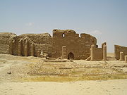 Temple of Bel (floating). |
The caption-text can be omitted, or remove the parameter "thumb|" so the caption is hidden until "mouse-over display". Unfortunately the parameter "thumb|" (used for displaying the caption) also controls the auto-thumbnailing to re-size images by user-preferences size. To have auto-thumbnail sizing while also concealing the caption, use |frameless|right| instead of |thumb|.
An image set with parameter "left|" will gain a wide right-side margin (opposite margin of parameter "right|"), so floating toward the left would require an image set as "center|" inside a table with style="float:left; margin:0.46em 0.2em".
Recall that, outside an image-table, the parameter "right|" causes an image to align (either) above or below an infobox, but would not float alongside the infobox.
Note the order of precedence: first come infoboxes or images using "right|", then come the floating-tables, and lastly, any text will wrap that can still fit. If the first text-word is too long, no text will fit to complete the left-hand side, so beware creating a "ragged left margin" when not enough space remains for text to fit alongside floating-tables.
If multiple single image-tables are stacked, they will float to align across the page, depending on page-width. The text will be squeezed to allow as many floating-tables as can fit, as auto-aligned, then wrap whatever text (can still fit) at the left-hand side.
 ...by float: right |
 ...images wrap... |
 All these... |
That auto-aligning feature can be used to create a "floating-gallery" of images: a set of 20 floating-tables will wrap (backward, right-to-left) as if each table were a word of text to wrap across and down the page. To wrap in the typical direction (wrapping left-to-right) define all those floating-tables, instead, as left-side tables using the top parameter style="float:left; margin:0.46em 0.2em". Multiple floating-images empower more flexible typesetting of images around the text.
Combined use of COLSPAN and ROWSPAN
Wiki markup:
{| border="1" cellpadding="5" cellspacing="0"
|-
| Column 1 || Column 2 || Column 3
|-
| rowspan="2" | A
| colspan="2" style="text-align: center;" | B
|-
| C <!-- column 1 occupied by cell A -->
| D
|-
| E
| rowspan="2" colspan="2" style="text-align: center;" |F
|-
| G <!-- column 2+3 occupied by cell F -->
|-
| colspan="3" style="text-align: center;" | H
|}
As it appears in a browser:
| Column 1 | Column 2 | Column 3 |
| A | B | |
| C | D | |
| E | F | |
| G | ||
| H | ||
Note that using rowspan="2" for cell G combined with rowspan="3" for cell F to get another row below G and F won't work, because all (implicit) cells would be empty.
Likewise complete columns are not displayed if all their cells are empty. Borders between non-empty and empty cells might be also not displayed (depending on the browser), use to fill an empty cell with dummy content.
Workarounds
Decimal point alignment
The following is a method to get columns of numbers aligned at the decimal point.
Wiki markup:
{| cellpadding="0" cellspacing="0"
| align="right" | 432 || .1
|-
| align="right" | 43 || .21
|-
| align="right" | 4 || .321
|}
As it appears in a browser:
| 432 | .1 |
| 43 | .21 |
| 4 | .321 |
If the column of numbers appears in a table with cell padding or cell spacing, you can still align the decimal points without an unsightly gap in the middle. Embed a table in each number's cell and specify its column widths. Make the embedded tables' column widths the same for each cell in the column. (If decimal points are still misaligned using this method, the main table's column may be too narrow. Add a parameter to increase the column's width.)
Wiki markup:
{| border="1" cellpadding="4" cellspacing="2"
|
{| cellpadding="0" cellspacing="0" width="100"
| align="right" width="50%"| 432 || width="50%" | .1
|}
|-
|
{| cellpadding="0" cellspacing="0" width="100"
| align="right" width="50%"| 43 || width="50%" | .21
|}
|-
|
{| cellpadding="0" cellspacing="0" width="100"
| align="right" width="50%" | 4 || width="50%" | .321
|}
|}
As it appears in a browser:
| ||
| ||
|
In the case of preformatted text, you can dispense with the table feature entirely and simply start the lines with a space, and put spaces to position the numbers:
Wiki markup (just spaces!):
432.1
 43.21
  4.321
As it appears in a browser:
432.1
 43.21
  4.321
However, there should be a good reason to use pre-formatted text in an article.
Centering tables
See: Whole table operations|Centering tables
Classes
In the first line of table code, after the "{|", instead of specifying a style directly, you can also specify a class, which may be used to apply styles. The style for this class can be specified in various ways:
- in the software itself, per skin (for example the class sortable)
- collectively for all users of one wiki in MediaWiki:Common.css (for example, on this and some other projects there is or was the class wikitable, later moved to shared.css)
- separately per skin in MediaWiki:Monobook.css etc.
- individually on one wiki in a user subpage
- individually, but jointly for tables of the class concerned on all web pages, on the local computer of the user.
Instead of remembering table parameters, you just include an appropriate class after the {|. This helps keep table formatting consistent, and can allow a single change to the class to fix a problem or enhance the look of all the tables that are using it at once. For instance, this:
{| cellpadding="2"
|+ Multiplication table
|-
! scope="col" | ×
! scope="col" | 1
! scope="col" | 2
! scope="col" | 3
|-
! scope="row" | 1
| 1 || 2 || 3
|-
! scope="row" | 2
| 2 || 4 || 6
|-
! scope="row" | 3
| 3 || 6 || 9
|-
! scope="row" | 4
| 4 || 8 || 12
|-
! scope="row" | 5
| 5 || 10 || 15
|}
|
| |||||||||||||||||||||||||
| becomes this: | ||||||||||||||||||||||||||
{| class="wikitable"
|+ Multiplication table
|-
! scope="col" | ×
! scope="col" | 1
! scope="col" | 2
! scope="col" | 3
|-
! scope="row" | 1
| 1 || 2 || 3
|-
! scope="row" | 2
| 2 || 4 || 6
|-
! scope="row" | 3
| 3 || 6 || 9
|-
! scope="row" | 4
| 4 || 8 || 12
|-
! scope="row" | 5
| 5 || 10 || 15
|}
|
| |||||||||||||||||||||||||
simply by replacing inline CSS for the table by class="wikitable". This is because the wikitable class in MediaWiki:Common.css contains a number of table.wikitable CSS style rules. These are all applied at once when you mark a table with the class. You can then add additional style rules if desired. These override the class's rules, allowing you to use the class style as a base and build up on it:
Wiki markup
{| class="wikitable" style="font-style:italic; font-size:120%; border: 3px dashed red;"
|+ Multiplication table
|-
! scope="col" | ×
! scope="col" | 1
! scope="col" | 2
! scope="col" | 3
|-
! scope="row" | 1
| 1 || 2 || 3
|-
! scope="row" | 2
| 2 || 4 || 6
|-
! scope="row" | 3
| 3 || 6 || 9
|-
! scope="row" | 4
| 4 || 8 || 12
|-
! scope="row" | 5
| 5 || 10 || 15
|}
As it appears in a browser:
| × | 1 | 2 | 3 |
|---|---|---|---|
| 1 | 1 | 2 | 3 |
| 2 | 2 | 4 | 6 |
| 3 | 3 | 6 | 9 |
| 4 | 4 | 8 | 12 |
| 5 | 5 | 10 | 15 |
Notice that the table retains the gray background of the wikitable class, and the headers are still bold and centered. But now the text formatting has been overridden by the local style statement; all of the text in the table has been made italic and 120% normal size, and the wikitable border has been replaced by the red dashed border.
Of course this works only for browsers supporting inline CSS, if it's important use XHTML markup like <big> instead of "font-size:120%", or Wiki markup like ''text'' instead of "font-style:italic".
Collapsible tables
Classes can also be used to collapse tables, so they are hidden by default. Use the style 'collapsible' to enable collapsing behaviour. By default, a collapsible table will begin expanded. To change this, include the additional class 'collapsed' or 'autocollapse' (i.e. only collapse if 3 other collapsible tables are present). You must include a header row, where the 'hide' option will be displayed. Example:
{| class="wikitable collapsible collapsed"
|-
! Header
|-
| Content which starts hidden
|-
| more hidden content
|}
Gives:
| Header |
|---|
| Content which starts hidden |
| more hidden content |
Using class mw-collapsible
Another way (worked in mediawiki 1.19rc1)testwiki:User:Krinkle/CollapsingTestpageMw
{| class="wikitable sortable mw-collapsible"
| Header |
|---|
| Content which starts visible |
| more visible content |
{| class="wikitable sortable mw-collapsible mw-collapsed"
| Header |
|---|
| Content which starts hidden |
| more hidden content |
Sorting
Tables can be made sortable by adding class="sortable"; for details see Help:Sorting. Since this can be very useful, it is wise to keep the possibilities and limitations of this feature in mind when designing a table. For example:
- Do not divide a table into sections by subheaders spanning several rows. Instead, an extra column can be made showing the content of these headers on each row, in a short form.
- Do not have elements spanning several columns; instead, again, repeat the content on each row, in a short form.
- In a column of numbers, do not put text such as "ca." before or after a number – it will break numerical sorting. Do not put any text or alphabetical characters in any cell of a column to be sorted numerically. Try not to put a range of numbers (it does not affect the sorting position for numeric sorting mode, and in the case of a range, the first number determines the position, but if, possibly after sorting this or another column, the element is at the top, it will induce alphabetic sorting mode). Instead, put these texts in a separate column. Alternatively, for the greatest flexibility, alphabetic sorting mode with hidden sortkeys can be used.
A long form of abbreviated content can be put as legend outside the table.
Wiki markup
{| class="wikitable sortable" border="1"
|+ Sortable table
|-
! scope="col" | Alphabetic
! scope="col" | Numeric
! scope="col" | Date
! scope="col" class="unsortable" | Unsortable
|-
| d || 20 || 2008-11-24 || This
|-
| b || 8 || 2004-03-01 || column
|-
| a || 6 || 1979-07-23 || cannot
|-
| c || 4 || 1492-12-08 || be
|-
| e || 0 || 1601-08-13 || sorted.
|}
As it appears in a browser:
| Alphabetic | Numeric | Date | Unsortable |
|---|---|---|---|
| d | 20 | 2008-11-24 | This |
| b | 8 | 2004-03-01 | column |
| a | 6 | 1979-07-23 | cannot |
| c | 4 | 1492-12-08 | be |
| e | 0 | 1601-08-13 | sorted. |
Numerical and year sorting problems
See Help:Sorting.
Sorting and collapsing
It is possible to collapse a sortable table. To do so, you need to use the code
{| class="wikitable sortable collapsible". Taking the above table and making it collapsable gives you this:
Wiki markup
{| class="wikitable sortable collapsible" border="1"
|+ Sortable and collapsible table
|-
! scope="col" | Alphabetic
! scope="col" | Numeric
! scope="col" | Date
! scope="col" class="unsortable" | Unsortable
|-
| d || 20 || 2008-11-24 || This
|-
| b || 8 || 2004-03-01 || column
|-
| a || 6 || 1979-07-23 || cannot
|-
| c || 4.2 || 1492-12-08 || be
|-
| e || 0 || 1601-08-13 || sorted.
|}
As it appears in a browser:
| Alphabetic | Numeric | Date | Unsortable |
|---|---|---|---|
| d | 20 | 2008-11-24 | This |
| b | 8 | 2004-03-01 | column |
| a | 6 | 1979-07-23 | cannot |
| c | 4.2 | 1492-12-08 | be |
| e | 0 | 1601-08-13 | sorted. |
If you want the table to default to collapsed state, use the code {| class="wikitable sortable collapsible collapsed" in place of {| class="wikitable sortable collapsible"
Section link or map link to a row anchor
To enable a section link's anchor (or a map link's anchor), referencing a specific row within a table, an id="section link anchor name" parameter needs to be added to the row start |- or <tr>:
|- id="section link anchor name"
<tr id="section link anchor name">
Note that each anchor name must be different from every other in the page (this includes heading names), to create valid XHTML.
- Example of a map link to a row
When a country label, containing a link, is clicked on the map, the link coded, for example, as [[#Table_row_11|Slovenia]] that references the anchor (within the table), coded as |- id="Table_row_11", will make the page scroll so the top line of the page (table) will be the selected row.
|
↦ |
| ||||||||||||||||||||||||||||||||||||||||||||||||||||||||||||||||||||||||||||||||||||||||||||||||||||||||||||||||||||||||||||||||||||||||||||||||||||||||||||||||||||||||||||||||||||||||||||||||||||||||||||||||||||||||||||||||||||||||||||||||||||||||||||||||||||||||||||||||||||||||||||||||
Row template
Regardless of whether wikitable format or HTML is used, the wikitext of the rows within a table, and sometimes even within a collection of tables, has much in common, e.g.:
- the basic code for a table row
- code for color, alignment, and sorting mode
- fixed texts such as units
- special formats for sorting
In that case it can be useful to create a template that produces the syntax for a table row, with the data as parameters. This can have many advantages:
- easily changing the order of columns, or removing a column
- easily adding a new column if many elements of the new column are left blank (if the column is inserted and the existing fields are unnamed, use a named parameter for the new field to avoid adding blank parameter values to many template calls)
- computing fields from other fields, e.g. population density from population and area
- duplicating content and providing span tags with "display:none" for the purpose of having one format for sorting and another for display
- easy specification of a format for a whole column, such as color and alignment
Example:
Using m:help:table/example row template (talk, backlinks, edit)
{| class="wikitable sortable" border="1"
|-
! scope="col" | a
! scope="col" | b
! scope="col" | a/b
{{help:table/example row template|  50|200}}
{{help:table/example row template|   8| 11}}
{{help:table/example row template|1000| 81}}
|}
gives:
| a | b | a/b |
|---|---|---|
| 50 | 200 | 0.25 |
| 8 | 11 | 0.72727272727273 |
| 1000 | 81 | 12.345679012346 |
Conditional table row
- Main article: Wikipedia:Conditional tables
For a conditional row in a table, we can have:
{| class="wikitable" border="1"
 <!--
  Row one will be shown because the '1' evaluates
  to TRUE.
 -->
 {{ #if:1|{{!}}-
  ! scope="row" {{!}} row one, column one
  <!--
   Any {{!}}'s will get evaluated to the pipe
   character '|' since the template '!' just
   contains '|'.
  -->
  {{!}}row one, column two}}
 <!--
  Row two will NOT be shown because the space
  between the ':' and the '|' evaluates to FALSE.
 -->
 {{ #if: |{{!}}-
  ! scope="row" {{!}}  row two, column one
  {{!}}row two, column two}}
 <!--
  Row three will be shown.
 -->
 |-
  ! scope="row" {{!}} row three, column one
  | row three, column two
|}
Which gives the following table: (note how the second row is missing)
| row one, column one | row one, column two |
|---|---|
| row three, column one | row three, column two |
Other table syntax
Other types of table syntax that MediaWiki supports:
- XHTML
- HTML & wiki- | syntax (Do not use)
All three are supported by MediaWiki and create (currently) valid HTML output, but the pipe syntax is the simplest. Also, HTML & wiki- | syntax (i.e., unclosed | and |- tags) will not necessarily remain browser-supported in the future, especially on handheld internet-accessible devices.
See also HTML element#Tables. Note however that the thead, tbody, tfoot, colgroup, and col elements are currently not supported in MediaWiki.
Comparison of table syntax
| XHTML | Wiki-pipe | |||||
|---|---|---|---|---|---|---|
| Table | <table></table> |
{|
|}
| ||||
| Caption | <caption>caption</caption> |
|+ caption | ||||
| Row | <tr></tr> |
|- | ||||
| Data cell | <td>cell1</td><td>cell2</td> <td>cell3</td> |
| cell1 || cell2 | cell3 | ||||
| Header cell | <pre><th scope="col">column heading</th> <th scope="row">row heading</th> |
! scope="col" | column heading ! scope="row" | row heading | ||||
| Sample table |
| |||||
<table> <tr> <td>1</td> <td>2</td> </tr> <tr> <td>3</td> <td>4</td> </tr> </table> |
{|
| 1 || 2
|-
| 3 || 4
|}
| |||||
| Pros |
|
| ||||
| Cons |
|
| ||||
| XHTML | Wiki-pipe | |||||
See also Template talk:For#Tables.
Pipe syntax in terms of the HTML produced
The pipe syntax, developed by Magnus Manske, substitutes pipes (|) for HTML. There is an on-line script which converts html tables to pipe syntax tables.
The pipes must start at the beginning of a new line, except when separating parameters from content or when using || to separate cells on a single line. The parameters are optional.
Tables
A table is defined by {| ''params'' |} which generates "<table params></table>".
Rows
For each table, an HTML <tr> tag will be generated for the first row. To start a new row, use:
|-
which generates another "<tr>".
Parameters can be added like this:
|- params
which generates "<tr params>".
Note:
- <tr> tags will be automatically opened at the first <td> equivalent
- <tr> tags will be automatically closed at <tr> and </table> equivalents
Cells
Cells are generated either like this:
|cell1
|cell2
|cell3
or like this:
|cell1||cell2||cell3
which both generate "<td>cell1</td><td>cell2</td><td>cell3</td>". The "||" equals "newline" + "|".
Parameters in cells can be used like this:
|params|cell1||params|cell2||params|cell3
which will result in
<td params>cell1</td>
<td params>cell2</td>
<td params>cell3</td>
Headers
Produces a TH, functioning the same way as TD, but with different style. "!" is used instead of the opening "|". "!!" can be used instead of "||". Parameters still use "|", though. Example:
!params|cell1
Captions
A <caption> tag is created by
|+ Caption
which generates the HTML <caption>Caption</caption>
You can also use parameters:
|+ params|Caption
which will generate <caption params>Caption</caption>
Summaries
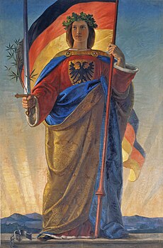
summary currently renders invalid HTML5. A fix has been requested to update summary to use valid HTML5 elements; see Template:BugA summary is produced by adding a summary attribute after the start of the table. It can be used by screen readers to give visually impaired readers the overall gist of the table, without having to listen to the entire table. For example:
{| summary="Artistic renderings of Germania became more triumphant and monumental."
| [[File:Philipp Veit 008.jpg|thumb|upright|alt=Robed woman, seated, with sword on her lap|Philipp Veit, ''Germania'', 1834–36]]
| [[File:Image Germania (painting).jpg|thumb|upright|alt=Robed woman, standing, holding a sword|Philipp Veit, ''Germania'', 1848]]
| [[File:Niederwald memorial 2.JPG|thumb|upright|alt=Monument of robed woman, standing, holding a crown in one hand and a partly sheathed sword in another|Johannes Schilling, ''Germania'', 1871–83]]
|}
produces:
Table cell templates
{{Table cell templates}} provide a set of templates to configure text and color in cells in a standard way, using phrases such as Yes, No or n/a.
Square monitors
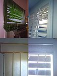
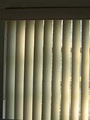
To format for a square monitor or window, use a tape measure. Determine the height of your rectangular screen. Using that figure measure under the screen to determine the width your monitor’s screen would be if it were square. Mark that location using ink or tape under the screen. Drag the side of your browser’s window to that location so the window is square based on accurate measurements. Square monitors and reading windows are not able to contain tables and galleries made for rectangular and wide screens. When a table or gallery is wider than the monitor, it makes every line of text wider than the screen as well. The px amounts of the following gallery were determined after measuring the window to make sure it was square:
Type this:
{| style="background: transparent; margin: auto;"
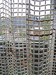
| [[File:Some window blinds.JPG|192x155px|thumb|left|Various window shades]]
| [[File:Vert-blinds-2145-rs.jpg|192x170px|thumb|left|Vertical blinds]]
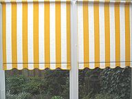
| [[File:Gardine.jpg|192x155px|thumb|left|This is not a blind]]
|}

{| style="background: transparent; margin: auto;"
| [[File:Vorhang.jpg|192x155px|thumb|left|Solid shade]]
| [[File:Jalousie-1.jpg|328x55px|thumb|left|Horizonal blinds]]
|}

{| style="background: transparent; margin: auto;"
| [[File:Some window blinds.JPG|205px|thumb|left|Shade, shutters; vertical & horizontal blinds.]]
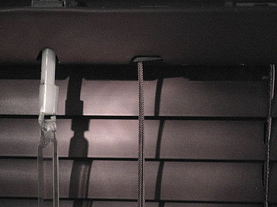
| [[File:Miniblinds detail of mechanism.jpg|388px|thumb|left|<!--
 -->Detail of turning rod (blind stick) attachment on miniblinds]]
|}
For this:
Vertically oriented column headers
Sometimes it is desirable (such as in a table predominantly made of numbers) to rotate text such that it proceeds from top to bottom or bottom to top instead of from left to right or right to left. Currently, browser support for this type of styling as a component of HTML or CSS is sporadic (Internet Explorer is one of the few browsers that supports this in cascading stylesheets, albeit in a non-standard way). An alternative solution that works in most if not all browsers is to use images in place of the text. For instance, the following table uses SVG images instead of text to produce the rotated column headings:
| 05/08 | 4266 | 7828 | 7282 | 1105 | 224 | 161 | 916 | 506 | 231 |
|---|---|---|---|---|---|---|---|---|---|
| 04/08 | 4127 | 6190 | 6487 | 1139 | 241 | 205 | 1165 | 478 | 301 |
Normally, one problem with this approach is that readers are directed to different pages when they click on the images. To eliminate this problem—or to direct readers to a different page—you can use the link parameter. A column-header can be coded as follows:
! style="width:3em;" | [[File:wpvg vg project.svg|link=xxxx]]
The image will wikilink to article "xxxx".
By setting the link to an empty string (e.g. [[File:wpvg hd date page.svg|link=]]), no navigation will occur when visitors click on an image. Note that it might also be a good idea to color the image text blue if you are using the images as links. Also, SVG is the preferred image format in this case because it can be re-scaled to any size without producing artifacts.
A more serious problem is that the "rotated text" is not text that can be used by screen readers and other technologies for visually-disabled users. So those users will not be able to "read" the column headings. Also automated search engine web crawlers would not be able to read the text.
Wikitable as image gallery
- This section is local to Wikipedia (hard-coded here now).
A wikitable can be used to display side-by-side images, in the manner of an image gallery (formatted by "<gallery>"), but with larger images and less vacant area around photos.
A simple framed gallery can be formatted using class="wikitable" to generate the minimal thin-lines around images/photos within the table:
 {| class="wikitable" border="1"
 |-
 |<!--column1-->[[File:Worms 01.jpg|265px]]
 |<!--column2-->[[File:Worms Wappen 2005-05-27.jpg|235px]]
 |-
 |<!--column1-->Nibelungen Bridge to Worms<br />across the [[Rhine]]
 |<!--column2-->Worms and its sister cities
 |}<!--end wikitable-->
Note the result below (with thin-lined cells):
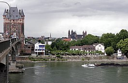
|

|
| Nibelungen Bridge to Worms across the Rhine |
Worms and its sister cities |
Another issue about the standard "<gallery>" tag, in 2007 to 2008, was that it put 4 images per line, overrunning the right margin of a wiki article displayed in portrait-style width (like 800x600), unless the gallery had only 3 images. However, a wikitable uses typical image-links with sizes, such as "[[Image:XXX.jpg|130px]]" so 4 images could be displayed on a wikitable line within a 600px width (for 800 × 600 resolution screens).
 {| class="wikitable" border="1"
 |-
 |<!--col1-->[[File:Worms 01.jpg|130px]]
 |<!--col2-->[[File:Worms Wappen 2005-05-27.jpg|125px]]
 |<!--col3-->[[File:Liberty-statue-with-manhattan.jpg|125px]]
 |<!--col4-->[[File:New-York-Jan2005.jpg|125px]]
 |-
 |<!--col1-->Nibelungen Bridge to Worms
 |<!--col2-->Worms and its sister cities
 |<!--col3-->Statue of Liberty
 |<!--col4-->New York City
 |}<!--end wikitable-->

|

|

|

|
| Nibelungen Bridge to Worms | Worms and its sister cities | Statue of Liberty | New York City |
Another advantage about wikitable images, compared to "<gallery>" formatting, is the ability to "square" each image when similar heights are needed, so consider putting 2-number image sizes (such as "199x95px"), where the 2nd number limits height:
 {| class="wikitable" border="1"
 |-
 |<!--col1-->[[File:Liberty-statue-with-manhattan.jpg|199x95px]]
 |<!--col2-->[[File:New-York-Jan2005.jpg|199x95px]]
 |<!--col3-->[[File:Gold star on blue.gif|199x95px]]
 |<!--col4-->[[File:Worms 01.jpg|100x95px]]<!--smaller-->
 |-
 |<!--col1-->Statue of Liberty
 |<!--col2-->New York City
 |<!--col3-->Star on blue
 |<!--col4-->Bridge to Worms
 |}<!--end wikitable-->
Note the 3 images sized "199x95px" appear identical height, of 95px (4th image purposely smaller). The "95px" forces height, while "199x" fits the various widths (could even be "999x"):

|

|

|

|
| Statue of Liberty | New York City | Star on blue | Bridge to Worms |
Therefore, the use of size "199x95px" (or "999x95px") produces the auto-height-sizing beyond the "<gallery>" tag, and with the option to set taller thumbnails ("199x105px"), or even to have some images purposely smaller than other images of "95px" height. A very short height ("70px") allows many more images across the table:
 {| class="wikitable" border="1"
 |-
 |<!--col1-->[[File:Liberty-statue-with-manhattan.jpg|199x70px]]
 |<!--col2-->[[File:Gold star on blue.gif|199x70px]]
 |<!--col3-->[[File:New-York-Jan2005.jpg|199x70px]]
 |<!--col4-->[[File:Gold star on deep red.gif|199x70px]]
 |<!--col5-->[[File:Worms 01.jpg|199x70px]]<!--same height-->
 |<!--col6-->[[File:Gold star on blue.gif|199x70px]]
 |}
The above wikitable-coding produces the result below, of 6 columns:

|

|

|

|

|

|
Once images have been placed in a wikitable, control of formatting can be adjusted when more images are added.
Shifting/centering
Images within a wikitable can be shifted by inserting non-breaking spaces (" ") before or after the image-link (" [[Image:]]"). However, auto-centering simply requires use of center-tags to be placed around an image-link for centering in a cell ("<center>[[File:..]]</center>").
In the example below, note how Col2 uses <center>, but Col3 uses " ":
{| class="wikitable" border="1"
|-
|<!--Col1-->[[File:Domtoren vanaf Brigittenstraat.jpg|299x125px]]
|<!--Col2--><center>[[File:Utrecht 003.jpg|299x125px]]</center>
|<!--Col3--> [[File:Uitzicht--Domtoren.jpg|299x125px]]
|-
|<!--Col1-->Dom tower from Brigittenstraat
|<!--Col2-->Cloister garth of the Utrecht Dom Church
|<!--Col3--> <small>View from bell tower</small>
|}
The above coding generates the table below: note the middle garden image is centered (but not the left image), and the right image has 2 spaces before " View...":
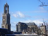
|

| |
| Dom tower from Brigittenstraat | Cloister garth of the Utrecht Dom Church | View from bell tower |
Also note that the tag "<small>" made a smaller text-size caption. However, fonts also can be sized by percent (style="font-size: 87%;"), where the actual percent-size as displayed depends on the various sizes allowed for a particular font.
| style="font-size: 87%;" | View from bell tower
The column attribute, above, uses "style=" to set the font-size for the caption, following the 2nd vertical-bar "|".
A font-size: 65% is very small, while style="font-size: 87%;" is a mid-size font, larger than the tag small.
Generate a chart with a table
- Main article: meta:Visualizer for Wikimedia projects
Using {{visualizer}} or another template that uses {{metavisualizer}}.
Converting spreadsheet to wikitable format
To convert from spreadsheets such as Gnumeric, MS Excel or OpenOffice.org Calc, you can use the Copy & Paste Excel-to-Wiki converter.
csv2wp – converts comma-separated values (CSV) format to pipe syntax. You may use this to import tables from Excel etc. (more information)
Tables and WYSIWYG
Due to the complexity of wikimarkup (especially tables), a common question is if there is any visual editor to make creating and modifying tables easier. Unfortunately at the moment no such editor exists, however it is possible to create a table with a HTML editor (like Adobe Dreamweaver) and then copy the html code generated by this into the page.
It is possible in the future that a WYSIWYG editor will be adopted (there has been much discussion about this in the past, however there are many technical hurdles that need to be solved). For the more technically inclined/adventurous tools such as WYSIFTW exist, however they do not incorporate the complete WYSIWYG experience and currently do not support tables (although they may do so in the future).
See also
- Help:Table/Introduction to tables
- Wikipedia:Manual of Style/Tables
- mw:Help:Tables
- mw:Simplified table syntax
- m:Wiki markup tables
- m:Table background colors
- Help:Sorting
- m:Help:Sorting
- User:Dcljr/Tables
- Table (HTML)
- m:Help:Template#A parameter value containing a pipe character
- Category:Table and column templates
- Examples:
- Commons:Chart and graph resources
- Commons:Convert tables and charts to wiki code or image files
- {{List to table}} template and its maintenance category: Category:Articles requiring tables
External links
 Editing Wikitext/Tables at Wikibooks
 Editing Wikitext/Tables Ready to Use at Wikibooks
- de:Wikipedia:Helferlein/VBA-Macro for EXCEL tableconversion, published in German-Wikipediaproject (English instructions included)
- HTML tables to wiki converter at uni-bonn.de
- HTML-WikiConverter, various versions and languages
- pywikipediabot, can convert HTML tables to wiki
- Table of CSS color names and HEX codes


